ShopDreamUp AI ArtDreamUp

Deviation Actions


Suggested Deviants


Suggested Collections


You Might Like…


Description
Hello Guys. I`m from Ukraine. Starts really hard times for me, my family and nation in the whole
We would happy to receive any kind of support to stay safe
Donation link for Paypal ---> www.paypal.com/cgi-bin/webscr?…
Thank you a lot guys for your support. I could make commissions for you in the future.
or I could give you original images as a gift
My E-mail: Azotconcept@gmail.com (Paypal as well)
I can make illustrations, concept art, book covers, game locations, characters etc
Feel free send me mail with your description and we can make breathtaking art for you!
Instagram</b>


We would happy to receive any kind of support to stay safe
Donation link for Paypal ---> www.paypal.com/cgi-bin/webscr?…
Thank you a lot guys for your support. I could make commissions for you in the future.
or I could give you original images as a gift
My E-mail: Azotconcept@gmail.com (Paypal as well)
I can make illustrations, concept art, book covers, game locations, characters etc
Feel free send me mail with your description and we can make breathtaking art for you!
IF YOU LIKE MY WORKS YOU CAN FOLLOW ME ON FACEBOOK AND INSTAGRAM
FacebookInstagram</b>
Image size
2089x1138px 934.19 KB
© 2016 - 2024 Azot2023
Comments27
Join the community to add your comment. Already a deviant? Log In
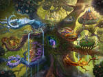
This piece is amazing as always. Well done on the idea of the ice cave. I can't draw as well as you, but I'd like to point out a few things.
I liked your vision for this piece. It was really good from the point of view of where you began it from. My one and only complaint is the fact that what feels to be the main attraction to it, the brightly lit part of the cave, was too far away to get anything out if it. I think that vision from our point of view also lacked due to the fact that the colors began to get muddled and unclear on the left side. It felt like I was looking at two completely different pieces, one abstract drawing style, and one realistic. (If you wonder what I mean by abstract, I'll direct your attention to the short film 'Feast')
The originality is very good. It feels like this could be any type of location. I like how the yellow part in the back is own little separate entity. I'm glad this doesn't require any previous knowledge or access understanding to view it.
I was really disappointed with the technique this time. Don't get me wrong, I like all kinds of artwork forms; but it feels, from initial eye draw, like a realism piece. Where you try to replicate it as if it were real life. However, with a quick glance over the rest of the piece you can see that's just not the case. The ice crystals are really what hits you hardest. It feels like you put only a bit of effort into them.
For Impact, honestly, the whole piece comes off as a half finished piece of work. At first glance, it seems like a perfectly normal painted piece, but anything beyond a glance will show you that it just doesn't sit right. You've got a great eye for detail, with the stalagmites, the reflections on the water, and the broken pieces of ice. I'll bump you up a whole star for that. I just think it's incomplete.
In conclusion, I'd say that this work is having trouble finding where it's supposed to be. You should either make the yellow area a bit more blocky to fit the rest of the piece, or touch up on the rest of the piece. I do want to end by saying that I'm a huge fan of your work and that you are much more skilled than I am. I just feel like you could've done a better job on this one.